This past year, each NHL team (Seattle Kraken not included) added a Reverse Retro Jerseys to their repertoires. The Reverse Retro Jerseys took the teams’ classic jerseys and put a modern twist on them. I will be ranking each Reverse Retro Jersey on their design, creativity, and how they show their classic jerseys with a modern influence.
This list is solely based on my subjective opinion and is in no way the definitive ranking of these designs. Also, if a team’s jersey is not included on this list, I believe their Reverse Retro jerseys are too similar to their regular home or away jerseys.
Top 25 NHL Reverse Retro Jerseys
25. Pittsburgh Penguins
I think there’s nothing egregiously wrong with the Penguins Reverse Retro jerseys. They’re just kind of boring. These jerseys are a throwback to those Penguins used in the nineties, but instead of being black, they’re now white. I think the Penguins missed an opportunity to use their other logo from the nineties of a penguin. I think that logo with a yellow background or even the lettered logo with a yellow background would be better than their current Reverse Retro jerseys.
24. Anaheim Ducks
While the Ducks certainly have one of the most creative and crazy designs, I find it incredibly aesthetically unpleasant. The jerseys are a throwback to the Duck’s third jerseys from the 1995-1996 season, but their Reverse Retro jerseys have a white background instead of teal. I think instead of using this logo, they should’ve used the same logo, but with their current orange and black color scheme, similar to their current alternate jerseys.
23. Philadelphia Flyers
Out of all of the jerseys on this list, the Flyers’ Reverse Retro Jerseys definitely look the most similar to their current jerseys. It’s tough to design a Reverse Retro jersey for a team whose jersey has remained very similar for all of their fifty-four-year history.
The Reverse Retros are supposed to be a throwback to their orange jerseys from 1982-2007; though, I wouldn’t have been able to tell you that just by looking at them. The orange and black together look pretty good, and I don’t think I could do much better. However, I feel like a Reverse Retro jersey that is so similar to what we see every game doesn’t deserve to be any higher on this list.
22. Minnesota Wild
I think the Wild missed a huge opportunity with their Reverse Retro jerseys. The Wild’s Reverse Retros feature their current logo and jersey design but instead of their current color scheme of burgundy and forest green, their colors are yellow and a lighter green. This is of course the color scheme of the Minnesota North Stars who moved to Dallas in 1993.
I think the North Stars have one of the better logos in NHL history, and to not use it is a huge missed opportunity. I think an inverse of what the Wild’s Reverse Retro Jerseys: the North Stars’ logo with the Wild’s colors, would look much better than what they currently have.
21. Boston Bruins
RELATED: The 25 NHL Players Who Won The Most Stanley Cups
Despite having a few logos in their catalog to choose from, the Bruins used a logo very similar to the one they currently use. The exact uniform the Bruins’ Reverse Retros are derived from are their uniforms used from 1981-1995 but with yellow instead of white or black.
While I think the jerseys themselves actually look pretty good, I had to put the Bruins lower on this list for showing a lack of creativity. I think the Bruins’ 1925-1926 jerseys but with the bear logo and black instead of brown would have looked much better and have been a welcome break from the Bruins’ B logo.
20. Toronto Maple Leafs
The Maple Leafs’ Reverse Retro jerseys aren’t terrible, but they aren’t anything special either. Their colors have remained blue and white for over ninety years, but they had a collection of iterations of their Maple Leaf logo to pick from. The Leafs went with their logo from 1967-1970 and used silver instead of white for their secondary color.
While I’m okay with the uniform, I would’ve liked to have seen the Leafs use one of the Toronto Arenas logos instead. That being said, the current Reverse Retros are passable.
19. Vegas Golden Knights
Being such a new franchise, many wondered what the Golden Knights’ Reverse Retro jerseys would look like. Since the Golden Knights are an expansion team, and the NHL has never had a team in Las Vegas before the Knights, the Golden Knights turned to the Las Vegas Thunder of the International Hockey League.
The logo on the jersey is the Golden Knights’ secondary logo, and the red is sparingly featured on the sleeves of their normal jerseys. The only connection to the Thunder comes from the “v” striping pattern on the jersey. I’m glad that the Golden Knights at least tried to think outside the box with the slight incorporation of the Thunder’s jersey, but the jersey as a whole feels cluttered and awkward; hence, the low ranking on this list.
18. Montreal Canadiens
The Canadiens are one of the many teams on this list who were difficult to create Reverse Retro jerseys for as a result of their relatively unchanged logo and uniform over the years. Though their uniforms have received minimal changes over the decades, the Habs’ Reverse Retros apparently come from their 1977 uniforms, but with the red and blue elements switched.
I really liked these jerseys at first, but their appeal has worn off on me. The blue and red look somewhat cool, but the logo is the exact same as it always has been and just feels a bit stale. I’m not sure if I could do much better, but these just feel a bit mediocre.
17. Winnipeg Jets
With the new Winnipeg Jets moved from Atlanta to Winnipeg in 2011, the franchise had to look for inspiration for their Reverse Retro jerseys from the original Winnipeg Jets. The Jets’ Reverse Retros come from the uniforms throughout the nineties but with a navy blue and grey color scheme instead of their original red and white. Considering their incredibly limited catalog of jerseys, the Jets did a decent job with their Reverse Retros.
Since the current Jets moved from Atlanta in 2011, I would have liked to have seen the Jets possibly use something from the Thrashers catalog in their Reverse Retros. If they were unable to do that, I would’ve at least liked to have seen the navy blue featured more prominently. I understand that with their limited catalog the Jets didn’t have many options available to them, but I think these don’t quite hit the mark.
16. New York Rangers
Many fans of both the Rangers and the NHL as a whole were excited to see the Rangers’ Lady Liberty logo return to their jerseys as well as the darker Navy Blue that comes with it. While the striping pattern is a bit different, the Rangers’ Reverse Retros come from the team’s alternate jerseys from 1996-1998 and from 1999-2007.
Though these jerseys are quite popular, I don’t think they quite stack up to some of the other Reverse Retros. They don’t look bad, but the Rangers’ jerseys are just a bit plain in comparison to some of the others.
15. Buffalo Sabres
Though they might be the worst team in the NHL right now, the Sabres have some decent Reverse Retro jerseys. The Sabres’ Reverse Retros are their alternate jerseys from 2000-2006 but with their current Blue and Yellow color scheme instead of red and black. I think these jerseys look fairly good, but the “Buffalo” along the bottom of the jersey is a bit awkward.
I understand it was a part of the original jersey, but that doesn’t mean you can’t remove it to improve the look of the jersey. I might have also used the buffalo head logo featured on the Sabres’ home and away jerseys from 1996-2006 on a blue background instead, but the Reverse Retros they have now still look pretty nice.
14. Dallas Stars
RELATED: Canadiens’ Jake Evans Stretchered Off Ice After Vicious Hit from Jets’ Mark Scheifele
I had thought the Stars’ Reverse Retro jerseys looked underwhelming at first, but the polished look of them has really grown on me. The Stars’ Reverse Retros are based on their alternate jerseys from 1997-1999 and their regular jerseys from 1999-2006. The jerseys are definitely sleek, and I could absolutely see some people would put them even higher on this list. I think the Stars’ jerseys couldn’t have looked much better than this, and the different elements from their different jerseys were well integrated with their Reverse Retros.
13. Columbus Blue Jackets
For being such a relatively young franchise, the Blue Jackets have done well with their Reverse Retro jerseys. The Blue Jackets’ Reverse Retros feature the logos from their inaugural season in 2000 that lasted until they rebranded in 2007. As opposed to their original jerseys which were navy blue with a red stripe, the Jackets’ Reverse Retros are red with a navy blue stripe.
Aside from the red of the jersey on the red logo being a bit off-putting, Columbus did a pretty good job with these. After wearing solely navy blue jerseys at home for all of their twenty-one-year history, it’s refreshing to see the Blue Jackets in red at Nationwide Arena.
12. Chicago Blackhawks
The Blackhawks certainly took “retro” to heart when designing their Reverse Retro jerseys. The Blackhawks’ Reverse Retros are inspired by the jerseys they used eighty years ago in the 1940-1941 season. The logo on them is updated and the red, black, and white stripes have been replaced by solid black. The minimalistic look on the older uniforms really works for me. While I don’t think Chicago could have done too much better than this, I think the jerseys are just a little plain to be any higher on this list.
11. Carolina Hurricanes
While I was a little frustrated with the Wild for some of their decisions in designing their Reverse Retro jerseys, I am very frustrated with the Hurricanes’ Reverse Retro design, despite their high placement. Since the Canes were originally the Hartford Whalers, they used the Whalers jerseys with an almost identical color scheme to Hartford’s. I think the Whalers’ logo is the best in sports, so while it is exciting to see them on the ice again, it’s pretty disappointing to see how little Carolina did with them.
If the jerseys featured anybody’s logo except the Whalers, the Canes’ jersey wouldn’t have cracked the top twenty on this list. If the Hurricanes would’ve used Hartford’s logo and their own color scheme of red and black for their Reverse Retros instead, they would have easily been number one on this list.
10. Los Angeles Kings
When first looking at the Los Angeles Kings’ Reverse Retro jerseys, many may think their colors are coming from their NBA counterparts in the Lakers. The Kings’ Reverse Retros are purple and yellow as they were actually the team’s colors from 1967-1988. The logo on the jersey was also the Kings’ from 1991-1998. I think the Kings did a really good job with these jerseys. They look nice and the Kings did a great job of combining the different jerseys. Lastly, the Kings’ colorful Reverse Retros are refreshing from their normal black jerseys.
9. St. Louis Blues
The Blues’ Reverse Retro jerseys are some of the flashiest, and I am here for them. The Blues’ Reverse Retros are throwbacks to St. Louis’ road uniforms from 1995-1998 but with the red and blue on the uniform inverted. I’m a huge fan of the inversion of colors in these Reverse Retro jerseys, and the Blues did an excellent job of doing so with theirs. I really don’t think the Blues had that impressive of a catalog of jerseys to draw inspiration from, so to come up with Jerseys that look this good is quite remarkable.
8. Washington Capitals
The Capitals returned to their most beloved logo with their Reverse Retro jerseys. The Capitals’ Reverse Retros feature their Screaming Eagle logo they used from 1995-2007 but with their current red, white, and blue color scheme. I’m a huge fan of the Reverse Retros that use a team’s current color scheme on their classic logos, and the Capitals did this perfectly. My only complaint is that lettering is a bit off, but the Capitals were fantastic in taking what was already a great jersey with the Screaming Eagle and elevated it with their current red and blue color scheme.
7. Tampa Bay Lightning
The Lightning may be back-to-back Stanley Cup Champions, but their Reverse Retro jerseys are nothing to be ashamed of either. The Bolts’ Reverse Retros are the same design as their jerseys from 2001-2007 but with their current color scheme of blue and white instead of the black, white, and blue. Similar to the Caps, I’m a huge fan of how the Lightning used the designs from their early 2000s uniforms with their current color scheme.
The Lightning’s Reverse Retros are not only impressive for their integration of color and design, but the white and blue give the jerseys a particular sleekness. All in all, the Lightning really nailed it with their Reverse Retros.
6. New Jersey Devils
While the Devils have not changed their logo in their near-forty year history, they still managed to create fresh, good-looking Reverse Retro uniforms. The Devils’ Reverse Retros are the uniforms they used from 1982-1992 but with the red and green elements switched.
The red, green, and white uniforms sound awful on paper, but they somehow look really good. It’s also really refreshing to see the Devils in green instead of the usual red and black. The most impressive thing in all of this is that the Devils had next to nothing to work with in making their Reverse Retro jerseys and still made really good-looking jerseys.
5. San Jose Sharks
The Sharks’ uniforms have undergone minimal changes over the years. They’ve always had a black, white, and teal color scheme and logo of a shark biting through a hockey stick. The particular iteration of these jerseys the Sharks used for their Reverse Retro Jerseys is their 1998-2007 uniforms but with a grey instead of teal or white base.
While I see how these jerseys could be dismissed as plain, the specific shark logo used for the Reverse Retros looks great with the grey. I’ve always liked the Sharks’ uniforms, but I think their Reverse Retro jerseys are their best uniforms yet.
4. Arizona Coyotes
While I’m not generally a fan of the Coyotes’ uniforms, but I am a huge fan of their Reverse Retros. The Coyotes’ Reverse Retro jerseys come from their alternate jerseys from 1998-2003 but with a purple background instead of the green.
I’m not a big fan of Arizona’s Kachina Coyote logo, which is the logo featured on the Yotes’ alternate jersey for the past four years (excluding last season). However, I really like the Peyote Coyote logo (the logo featured on Arizona’s Reverse Retros) on the purple background. The Coyotes certainly took an artistic approach to their Reverse Retros, and it payed off.
3. Calgary Flames
Though they might not be number one on this list, the Flames’ Reverse Retro jerseys are some of the most fun in the league. Calgary’s Reverse Retros are based on their alternate jerseys from 1998-2000 which were then their home jerseys from 2000-2003. The only difference between the Reverse Retros and those is that the solid red elements were changed to be black as well, making the jerseys much sleeker. I think the horse logo on the solid black jersey with the red and yellow striping earn the Flames a top three spot on this list.
2. Colorado Avalanche
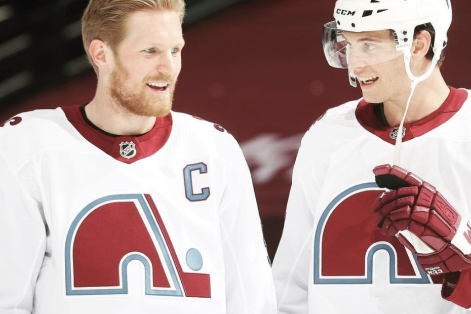
Because the Avalanche have had the same logo since they moved to Colorado, they had to look to the Quebec Nordiques for their Reverse Retro jerseys. The Avalanche’s Reverse Retros are the Nordiques’ away jerseys, but with the Avalanche’s maroon and darker blue color scheme instead of Quebec’s red and lighter blue.
The Avalanche’s Reverse Retros are so good because they did exactly what I wish the Hurricanes had done with theirs. The Nordiques had a very good logo just like the Whalers, and it somehow looks even better in Avalanche Maroon. The Avalanche did a fantastic job of paying homage to the Nordiques who came before them while putting a fresh spin on their uniform.
1. Florida Panthers
I was pretty bummed a few years ago when the Panthers rebranded and gave up the Panther logo they used for more than twenty years. So you could imagine my excitement when the Panthers released their Reverse Retro jerseys. While the Panthers have had navy blue jerseys featuring this logo before, Florida’s Reverse Retros are actually based on their original away jerseys from the nineties.
The red and navy blue elements of the jersey have switched as well as the gold and white elements, and the red, gold, and blue are all darker shades. I’ve already mentioned how much I like the Panther logo, but it looks even better on the navy blue jersey.
They may not have gotten past the first round of the playoffs last season, but the Panthers have the title for best Reverse Retro jerseys in my book.
Pierson Scheinberg is a student who lives in California, and attends the College Preparatory School. Pierson lived in Baltimore, Maryland until August 2017 when he moved to the Bay Area. Pierson is an avid golfer who enjoys watching all sports. He is a writer and sports analyst for At the Buzzer.
At The Buzzer, or ATB is the place for those who love sports, life, family, community, and so much more. We are far from the run-of-the-mill 24/7 sports news websites. We not only bring you what’s happening in the world of sports in terms of trades and breaking news, but we also bring you the news that goes on behind the scenes, like big life moments, and so much more. So take a minute and read one of our articles, we promise you won't regret it.
