Sometimes you look at a professional sports team’s logo and laugh, but that’s not the case when you look at the best sports logos ever. You begin to appreciate the intricate detail, the creativity, the simplicity, the relevance, the color schemes, and the hard work that went into it.
The truth is every professional sports team has a logo, but not all logos are created equal. Some of them grab your attention and receive constant praise, while others welcome frequent criticism and disgrace from those that support the team. It can work in your favor or nip you in the butt.
Throughout the years, we’ve seen sports logos come and go. Some teams end up maintaining the same logo for decades, while other teams seem to change theirs every five years. Although the best sports logos ever don’t always stick around for long, they’re certainly never forgotten.
RELATED: Top 25 All-Time Fastest Skaters in the NHL
What Are the Best Sports Logos Ever?
In order to truly rank the top 30 best sports logos ever, we have to go beyond the logos we see today. While there are a lot of good ones in the modern era and some that will crack this list, a majority of the best sports logos ever are either no longer used or used on special occasions.
What you’ll come to notice is that most of the sports logos worn today are horrendous compared to some of the older logos the team used to roll with. In fact, some of the current logos are so bad that they leave you wondering why they ever switched in the first place — it’s truly a shame.
With that said, we’re not here to talk about the worst sports logos ever — we’re here to rank the best sports logos ever. So without further ado, let’s take a look at some of the logos that make us proud. The logos that you won’t feel ashamed wearing on your hat, jersey, shirt, or jacket.
30. New York Mets
Years Used: 1962-present
Designed By: Ray Gotto
The New York Mets joined the MLB in 1962 as one of the first expansion teams, replacing the recently departed Brooklyn Dodgers and New York Giants. The Mets chose to adopt blue and orange as their primary colors — blue in honor of the Dodgers and orange in honor of the Giants.
Since 1962, the Mets have rolled with the same logo design and for good reason — it works. It’s an orange-outlined baseball with a blue skyline in the middle and a cursive ‘Mets’ wordmark in the center. In 1993, they darkened the blue and in 1999 they removed the ‘NY’ next to the ‘Mets.’
It’s a classic that shouldn’t be going anywhere anytime soon — I hope.
29. Toronto Raptors
Years Used: 1995-2008
Designed By: Tom O’Grady, John Bitove
When I see this vintage Toronto Raptors logo, I immediately think of Vince Carter flying through the air. While I’m not mad at their current logo, I think we can all agree that the Raptors should’ve never changed logos and should’ve stuck with the basketball-playing-raptor forever.
The colors are on point, the imagery is on point, the font is on point, the claws poking out of the raptor’s basketball shoes — also on point. Unfortunately, changes to the logo came in 2008. Despite keeping the same design, they switched out the purple background with a black one.
In 2015, Toronto completely changed the design and went with the raptor claw marks around the basketball. Not terrible, but not as good as it once was.
28. Manchester United
Years Used: 1998-present
Designed By: N/A
Since being founded in 1878, Manchester United Football Club has gone through seven different logos. Of all the changes they’ve made, the one they currently sport is one of the best sports logos ever. It’s what they wore during their glory days and what most fans know them for.
The logo is very similar to the one they ran with from 1973-1998. The main difference between the two is the old logo had ‘Manchester United’ on the top banner and ‘Football Club’ on the bottom banner. Today, the top banner reads ‘Manchester’ and the bottom reads ‘United.’
It features a yellow shield in the middle with a ship at the top (symbolizing urban trade) and a red devil holding a trident (to account for their Red Devils nickname). It’s a statement, that’s for sure.
27. Buffalo Sabres
Years Used: 1970-1996, 2010-present
Designed By: N/A
There’s a longstanding debate over which Buffalo Sabres’ logo is the best — the ‘goat head logo’ or the ‘butter knives logo.’ Personally, I’m rocking with the butter knives logo and it seems like Buffalo Sabres’ ownership is as well since they ended up bringing the logo back after a while.
It was the team’s original logo from 1970-1996 before they changed it to the goat head logo for 10 years. After five years of what many consider the worst sports logo ever — the Buffaslug — ownership decided it was time to bring back the butter knives (swords) in 2010, a smart move.
When they brought it back, they went with a darker blue than the original logo. Although it didn’t look that bad, it wasn’t the same. Luckily, they brought back the royal blue in 2020.
26. Golden State Warriors
Years Used: 1997-2010
Designed By: Tom O’Grady
The Golden State Warriors have had eight primary logos since joining the NBA in 1962 — they were originally founded as the Philadelphia Warriors back in 1946. Although their current logo isn’t that bad and I’m a fan of their 1969-1971 logo, neither are among the best sports logos ever.
That title belongs to their 1997-2010 logo, which featured a warrior holding the ‘Warriors’ wordmark and a basketball in the background. I thought this logo was unique, it was different, and it embodied the team well. Unfortunately, the ownership decided to change it in 2010.
Personally, I don’t think the new logo has any creativity, which is one of the things I want to see in the best sports logos ever. Oh well, at least we get to reminisce about the old days!
25. Dallas Cowboys
Years Used: 1964-present
Designed By: Jack Eskridge
The Dallas Cowboys’ logo is a tribute to Texas’ nickname, ‘The Lone Star State.’ When the Cowboys joined the league in 1960, it was originally just a blue star. They made minor changes in 1964, adding a thin blue outline around the star — which gave it a perfect sense of contrast.
It was the right move, especially considering the Dallas Cowboys have rocked with that same logo ever since — over 56 years! It’s rare for a professional sports team to have the same logo for that long, but there’s no reason to change it now. Despite its simplicity, it definitely works.
It’s one of the most recognizable and best sports logos ever. It’s true that not all sports logos need to be overly-creative and busy.
24. Dallas Mavericks
Years Used: 1980-2001
Designed By: N/A
Speaking of Dallas, let’s talk about the Dallas Mavericks’ logo — and no, not their current logo. Let’s take it back to 1980 when the Mavericks joined the NBA as an expansion team. To be honest, their logo was banging and it’s one of my favorite all-time vintage logos in the NBA.
On the left, it featured a green basketball in the background and a big blue ‘M’ wearing a cowboy hat. On the right, it featured the ‘Dallas Mavericks’ wordmark in blue and outlined in green. It was a fun logo and I was rocking with the green/blue color scheme — it grabbed your attention.
Unfortunately, the Dallas Mavericks switched to their current logo in 2001, doing away with the green and completely changing the design. They still use the green jerseys every now and then.
23. Washington Wizards
Years Used: 1997-2011
Designed By: N/A
I’m going to be honest, I’m not a fan of the Washington Wizards’ current logo — partly due to how boring it is, but mostly because I miss their old logo. The blue, gold, and black color scheme was classy and the wizard/moon combination gave it character — not to mention the hidden ‘W.’
Washington kept this logo from 1997, when they changed their name from the Bullets to the Wizards, until 2011. Although they kept the same design up until 2015, it featured a different color scheme — the red and blue we see today. In 2015, they completely changed the design.
Although the current logo falls in line with how NBA teams brand themselves in the modern era, I miss the cartoony-comic style logos. It was more fun and they need to start bringing it back.
22. Florida Panthers
Years Used: 1993-2016
Designed By: N/A
The Florida Panthers joined the NHL in 1993 as an expansion team, along with the Mighty Ducks of Anaheim — more on them later. When they unveiled their original logo, it was fierce, it was eye-catching, and it was very detailed — three things you want to see in a sports logo.
The logo would stick around for over 20 years, only seeing minor color changes along the way. In 2016, they decided they needed a new look and went with a more neutral, boring, and less fierce design. It doesn’t look terrible, but it’s a step in the wrong direction from what they had.
In their final season with their original logo, they had their best season as an NHL franchise. Since then, they’ve struggled to find consistency. Maybe they should go back to the old logo!
21. Charlotte Hornets
Years Used: 1988-2002
Designed By: N/A
I have absolutely nothing against the Charlotte Hornets’ current logo — in fact, I think it’s a highly underrated logo in today’s NBA — but there’s something about their original logo that I enjoy even more. It was fun and it embodied the cartoon effect that most vintage logos did so well.
I love how the hornet is wearing basketball shoes, I love how it’s dribbling a basketball, and I love how it’s trying to act feisty with its ‘tough guy’ look. It was the perfect design for that era and while it wouldn’t quite fit in the modern era, it still goes down as one of the best sports logos ever.
The Hornets would end up changing team names to the Bobcats in 2004 before reverting back to the Hornets in 2014 with an updated logo, officially saying goodbye to the old one.
20. Milwaukee Bucks
Years Used: 1968-present (all 4 designs)
Designed By: Tom O’Grady, Doubleday and Cartwright
Ever since the Milwaukee Bucks joined the NBA as an expansion team in 1968, they’ve sported four different logos. In my opinion, they all deserve to be listed among the best sports logos ever. They’re one of the only teams I can think of that consistently designed quality logos.
Their first one wasn’t that intimidating and falls under the ‘cute’ category, but it was still stylish. The second and third logos were very similar, but the purple one really hits home. Their newest logo, which was unveiled in 2015, is modern, sleek, and very professional — they’re all good!
19. Buffalo Bills
Years Used: 1974-present
Designed By: Stevens Wright
When the Buffalo Bills switched their logo from the red standing buffalo to the blue charging buffalo, it was a defining moment in the franchise’s history. Nothing against the standing buffalo, but it was a little boring and dull. The charging buffalo is different, especially with the red laser.
The change was much needed and it proved worthy because the Buffalo Bills have worn the same logo since 1974 — no changes needed over that time. They do, sometimes, feature the standing buffalo on their helmets, but we all know the charging buffalo is iconic and memorable.
18. Ottawa Senators
Years Used: 1992-2007, 2020-present
Designed By: N/A
The Ottawa Senators joined the NHL in 1992 and introduced what will become one of the best sports logos ever. After five years, they kept the same design and made minor changes to the ring of the puck, replacing the ‘Ottawa Senators’ wordmark with a neat little design.
In 2007, the Senators decided to change the logo design, which turned out to be a bad move. They eventually realized their mistake after 12 years and re-introduced their original logo design before the 2020-21 season, making minor changes to the color scheme — a solid decision.
17. Washington Capitals
Years Used: 1995-2002
Designed By: N/A
The Washington Capitals joined the NHL in 1974 as an expansion team and struggled to win games for the first 8 years of their existence. They started to make some noise in the early 1980s and have consistently been one of the top teams in the league ever since.
Over the past 46+ years, the Capitals have had four main primary logo designs. Personally, their logo from 1995-2002 was highly underrated. It featured a bald eagle in attack mode with its talons stretched out and stars on its body. It was a sleek design that looked good on jerseys.
16. New Orleans Saints
Years Used: 1967-present
Designed By: N/A
The New Orleans Saints have essentially been using the same logo ever since they joined the NFL as an expansion team in 1967. It has always featured the fleur-de-lis, but has seen minor changes — mostly in color — since its introduction. It’s easily one of the most recognizable logos.
From 1967-1999, the fleur-de-lis pattern was skinny and black with a white border. In 2000, they made the change to a gold fleur-de-lis with a white border and black outline. They also made it a little thicker. Since 2000, they’ve changed the gold color into a lighter shade.
15. Detroit Pistons
Years Used: 1996-2005
Designed By: Billy Berris
The Detroit Pistons, originally the Fort Wayne Zollner Pistons of the NBL and BAA, joined the NBA in 1957. For the next 20 years, they would sport an extremely boring logo with no real design initiative. From 1979-1995, they changed to something better, but it still lacked creativity.
It wasn’t until 1996 that they finally got creative with their logo. The colors were unique, the wordmark was unlike any other, it finally featured a horse (with flames), and there were even exhaust pipes — it screamed horsepower. Unfortunately, the logo only lasted nine years.
14. Denver Nuggets
Years Used: 1981-1993
Designed By: Carl Sheer
The Denver Nuggets joined the NBA in 1976 when the NBA and ABA merged. Their newest logo, which was introduced in 2018, is nothing compared to what they had from 2003-2018. Going back further than that, neither logo is as good as the one they used from 1981-1993.
The vintage logo featured a unique ‘Denver Nuggets’ wordmark on bottom and a half-circle on top. Inside the half-circle, they used a ton of different colors and followed a tetris theme for the Denver skyline. There are also mountains in the background, which is just icing on the cake.
13. Milwaukee Brewers
Years Used: 1978-1993
Designed By: Tom Meindel
The Milwaukee Brewers have had several solid logos, any of which could be considered on our list of the best sports logos ever. Their logo from 2000-2017 was a classic and what many modern fans remember them as. Even their 2018-2019 was good, yet very simplistic.
With that said, no Brewers’ logo will ever live up to the one they sported from 1978-1993. It was an ‘m’ and ‘b’ that meshed together in the shape of a ball inside a glove. It was simple, it was creative, and the light blue and gold colors were striking. They recently brought it back, kind of.
12. Mighty Ducks of Anaheim
Years Used: 1993-2006
Designed By: Tony Cipriano and Fred Tio
Who remembers when the Anaheim Ducks were called the Mighty Ducks of Anaheim? Weren’t those the good ‘ole days? The team was founded in 1993 and named after the 1992 film The Mighty Ducks. They ended up changing the name prior to the start of the 2006-07 season.
Sure, their current logo is creative and it was a good idea to shape the ‘D’ in the form of a duck’s webbed palmate (feet). With that said, nothing compares to the vintage logo the Mighty Ducks of Anaheim used. That duck-shaped goalie mask is nostalgic in every single way possible!
11. Columbus Blue Jackets
Years Used: 2000-2007
Designed By: Ken Loh
Before the Vegas Golden Knights and Seattle Kraken, the Columbus Blue Jackets were the newest NHL team — joining the league in 2000 along with the Minnesota Wild. It took Columbus a while to find success in the league, making it to the playoffs for the first time in 2009.
For the first six years they were in the league, their logo was awesome. It was colorful, the red and blue color scheme was on point, the ‘CBJ’ was eye-catching and creative, and it had character. While their new logo, introduced in 2007, isn’t bad, it doesn’t compare to the original.
10. Utah Jazz
Years Used: 1996-2004
Designed By: Ben Barnes
The Utah Jazz recently reintroduced their original logo — from 1979-1995 — in 2016 with minor color changes, but it’s in no way one of the best sports logos ever. Instead, the best logo they’ve ever sported was their 1996-2004 logo. It was fun and the color scheme was unlike any other.
While the design stayed the same up until 2016, they ended up doing away with the light blue, purple, green, and copper color scheme in 2004 — which was a huge mistake. They went to a light blue and dark blue color scheme from 2004-2010, then went downhill from there.
9. Boston Red Sox
Years Used: 1976-2008
Designed By: N/A
The Boston Red Sox are one of the most iconic, valuable, and recognizable sports franchises in the entire world. They’ve won nine World Series titles, which is tied for the third-most among all MLB teams. No tonly that, but their logo from 1976-2008 is one of the best sports logos ever.
The logo features the famous two cartoon red socks in the middle of a baseball. The baseball is surrounded by ‘Boston’ in blue letters on the top and ‘Red Sox’ in red letters on the bottom. The letters are then surrounded by a red circle that brings everything together — it’s a true classic.
8. St. Louis Cardinals
Years Used: 1922-1964, 1998-present
Designed By: Branch Rickey, Allie May Schmidt, Edward H. Schmidt
Speaking of MLB teams with a lot of World Series titles, the St. Louis Cardinals have the second most titles among MLB teams with 11. It’s no surprise that they also have one of the best sports logos ever — two of which can be considered, especially considering how similar they are.
The first one was used from 1922-1964 and it featured a baseball bat with two cardinals sitting on it. Next to the baseball bat was the ‘Cardinals’ wordmark. The second logo was similar, but it only featured one cardinal on the baseball bat and a different wordmark font that was cursive.
7. Montreal Canadiens
Years Used: 1917-present
Designed By:
It wouldn’t be right to mention the best sports logos ever without listing the Montreal Canadiens. Their classic ‘C’ logo has been around since 1917, though it has seen some minor changes since then. It used to be much more basic than the logo we see today, but it was still solid.
The logo we see today started to truly take shape in 1932, which is when the ‘C’ and inner ‘H’ gained an outer blue border. This really made the logo more appealing and pleasing to look at. In 1999, it saw another minor change by darkening the red color and making the logo a little bigger.
6. Quebec Nordiques
Years Used: 1985-1995
Designed By: N/A
The Quebec Nordiques played in the NHL from 1979-1995 before relocating and changing their name to the Colorado Avalanche. Although the Nordiques are no longer in the NHL, their logo is one of the best sports logos ever. It’s simple, but it’s memorable, recognizable, and unique.
The logo, which was used from 1985-1995, was designed to be a red igloo in the shape of an ‘n.’ A hockey stick and puck were located to the right of the igloo. The blue and red colors were classic and helped bring the logo together. The Nordiques’ logo is one we’ll always remember.
5. Boston Celtics
Years Used: 1968-present
Designed By: Zang Auerbach
The Boston Celtics have one of the most recognizable, iconic, and best sports logos ever. It features a winking leprechaun that’s spinning a basketball and smoking a pipe. The famous leprechaun is surrounded by a green circle with ‘Boston’ on the left and ‘Celtics’ on the right.
The logo went through a series of changes since 1968. It originally didn’t feature a green circle and instead featured a brown basketball in the background. In 1974, the green circle was added. In 1996, more color was added to the leprechaun, which helped bring out even more character.
4. Detroit Red Wings
Years Used: 1932-present
Designed By: James E. Norris
The Detroit Red Wings were one of the six original NHL teams. They’ve been playing under the Red Wings name since 1932 and were previously known as the Cougars and Falcons. In a league where logos change frequently, the Red Wings have never felt the need to change theirs.
In fact, the only change to their logo came in 1948 when they made it a little skinnier and sleeker, but the design stayed the same. Since 1948, not a single change has been made. That’s why it goes down as one of the best sports logos ever — it’s as iconic and recognizable as they come.
3. New York Yankees
Years Used: 1913-present
Designed By: Louis B. Tiffany
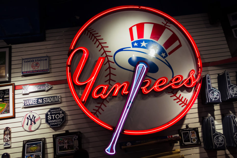
The New York Yankees are one of the most valuable sports franchises in the entire world. They lead all other MLB teams with 26 World Series titles — the next closest being the St. Louis Cardinals with 11. Not only that, but they have one of the best sports logos ever.
In fact, both of their logos can find their way on this list. The classic ‘NY’ logo was used from 1913-1946, while their current logo — the baseball hat and yankee hat — has been used since 1947. No matter where you are, you’re bound to see this logo somewhere.
2. Memphis Grizzlies
Years Used: 2001-2004
Designed By: N/A
The Memphis Grizzlies, originally established as the Vancouver Grizzlies in 1995, joined the NBA under their current name in 2001. Although they haven’t had much success in the league, they are known for having one of the best sports logos ever — it’s a shame it didn’t last long.
The logo we’re talking about is the first logo they ever had. It featured an intimidating grizzly bear holding a basketball with a unique ‘Memphis Grizzlies’ wordmark on top. They only used the logo from 2001-2004 before switching to their current logo, which is a step in the wrong direction.
1. Hartford Whalers
Years Used: 1979-1997
Designed By: Peter Good
There aren’t many sports logos as creative as the Hartford Whalers. It’s a shame they’re no longer in the league because this logo was straight fire. It featured a green ‘W’ on the bottom and blue whale’s tail on top. When combined, the two create an ‘H’ in the middle — it’s unique.
The Whalers joined the NHL in 1974 when the NHL merged with the WHA. They remained in the league until 1997, which is when they moved to North Carolina and are now known as the Carolina Hurricanes. With that said, the Whalers will be remembered for their awesome logo!
Which of the Best Sports Logos Ever Do You Like the Most?
Some sports logos only last for a few years, while some sports logos last for decades. The best sports logos ever are remembered forever, no matter how long they’re used by the team. Of the ones we listed above, which ones do you like the most? Which ones do you miss the most?
Of course, we didn’t even mention some of the other most popular sports logos to ever be designed — such as the Pittsburgh Steelers, New England Patriots, Oakland Raiders, Edmonton Oilers, Montreal Expos, Chicago Bulls, Miami Heat, Seattle Supersonics, and so much more.
YOU MAY ALSO LIKE: The Best Football Numbers Based On These NFL Stars
Since professional sports teams all across the country will continue changing their logos in the future, it’s possible we see some new sports logos find their way on this list. You also have to account for all the new teams that are being added as expansion teams every now and then!
30 NBA Logos Ranked From Worst to Best
NBA logos play an essential role in a franchise’s ability to form an identity and brand themselves in the greatest basketball league in the world. It’s what creates a sense of unity among those that represent the team, including ownership, front office, coaching staff, players, and fans.
Ever since the NBA was established in 1946, teams were tasked with designing a logo that not only represents their team name well, but also the city they play for. There’s a lot of thought that goes into the designing process, from the color scheme to the font and other graphic elements.
While some NBA logos have lasted the test of time, other NBA logos failed to make that lasting impact that owners are looking for. Sometimes logos change due to relocation, sometimes they change due to an ownership change, and sometimes the team is simply looking for a fresh start.
RELATED: 30 of the Best Sports Logos Ever
Ranking the 30 NBA Logos From Worst to Best
The NBA logos we see today are nothing like the logos we saw in the past. Many people consider the 1990s to be the golden age of NBA logos. This is when teams were the most creative with their logo, which often included cartoon elements, mascots, and unique graphics.
Unfortunately, the NBA has shifted away from those logo styles over the past two decades. Today, teams are slowly starting to gravitate towards circular, emblem, badge-like NBA logos with basic, generic fonts. It’s not that they’re ugly, but they’re certainly not what they used to be.
Still, some NBA teams are reluctant to change logos and for good reason — they’re legendary, iconic even. Other teams improved upon their design and created something better. And then there are the teams that completely dropped the ball on the assignment and made things worse.
Below, we’re going to talk about all of the above by ranking the current NBA logos from worst (30) to best (1). We’ll also detail when the logo made its debut, who designed it, what their record is since the logo debuted, and how many championships they’ve won with their current logo.
30. Brooklyn Nets
Year Debuted: 2012
Record Since: 325-393 (.453 winning percentage since 2012)
Championships Since: none
The Brooklyn Nets’ logo we see today is similar to the one they sported from 1997-2012. I think where they went wrong with today’s logo is removing the 3D effect to the shield and going with a more 2D look. This decision took away the character it had before, leaving it dull and boring.
I can understand the need to change logos, especially with the move from New Jersey to Brooklyn. Unfortunately, this logo just doesn’t do it for me. It’s not their worst logo ever — they’ve had eight total over the past 50 years — but I do believe it’s the worst logo in the NBA right now.
29. Detroit Pistons
Year Debuted: 2017
Record Since: 120-182 (.397 winning percentage since 2017)
Championships Since: none
The Detroit Pistons’ logo has gone downhill ever since they did away with their ‘horsepower’ logo, which they sported from 1996-2005. The logo we see today is an updated version of what they used from 1979-1996 and the only major difference is the font used in the center of the ball.
After the ‘horsepower’ logo, they transitioned to a 2D circular logo, but maintained a bit of 3D style with the font — giving it some character. All that personality was removed when they made the entire logo 2D, but maybe that’s why they haven’t had a winning season since the change.
28. Sacramento Kings
Year Debuted: 2016
Record Since: 160-230 (.410 winning percentage since 2016)
Championships Since: none
I’ve never really been a fan of the Sacramento Kings’ logo, but I think it’s clear they took a step back with their recent design. It’s similar to their first logo they used from 1985-1994, just with a bit of a face lift and color change. While it’s better than their first logo, that’s not saying much.
To be honest, I don’t like either one nearly as much as I like their second logo — which they used from 1994-2016. If they hadn’t changed their logo in 2016, they would rank much higher among NBA logos. Who knows, maybe they would have a better winning percentage than .410, as well.
27. Utah Jazz
Year Debuted: 2016
Record Since: 245-145 (.628 winning percentage since 2016)
Championships Since: none
The Utah Jazz used to have one of the coolest NBA logos, especially with their vintage color scheme from 1996-2004. Unfortunately, they decided to bring back their first logo in 2016 and kept their dark blue and yellow color scheme. If they hadn’t changed, they would rank higher.
Their logo today features a large ‘Jazz’ wordmark with the ‘J’ shaped as a musical note. The word ‘Utah’ fits on top in the right corner. It’s a fitting logo and is definitely creative, but doesn’t compare to their old one and isn’t as modern as some of the other NBA logos on this list.
26. Los Angeles Clippers
Year Debuted: 2015
Record Since: 290-182 (.614 winning percentage since 2015)
Championships Since: n/a
The Los Angeles Clippers have had their current logo since 2015, though they darkened the red color in 2018. I guess I’m not so much against the ‘LAC’ basketball featured in the logo, but the ‘Clippers’ wordmark is atrocious, too bold, too big, and doesn’t really match the rest of the logo.
The Clippers were better off with their old logo. The font was more unique, the colors weren’t as much of an eye sore, and it was more recognizable to NBA fans. Unfortunately, we won’t be seeing that logo anytime soon and it looks like they’ll be rolling with their new logo indefinitely.
25. Orlando Magic
Year Debuted: 2010
Record Since: 342-525 (.394 winning percentage since 2010)
Championships Since: none
The Orlando Magic have had three different logo designs since joining the league in 1989. While their current logo ranks 25th on our list of the best NBA logos, I will give them some credit because their new one is better than their old ones. It’s cleaner, more modern, and slicker.
I think the major difference they made with their current logo, which debuted in 2010, is the font. They used to go with a childish, cartoon-like boxed font, but changed it to a more modern-like font. They also did away with replacing ‘A’ with a star. It’s better, but still not as good as others.
24. Dallas Mavericks
Year Debuted: 2001
Record Since: 960-649 (.597 winning percentage since 2001)
Championships Since: 1 (2010)
The Dallas Mavericks have one of the coolest vintage logos in all of sports, but their current logo doesn’t quite cut it. It was introduced when Mark Cuban bought the team in 2000. He wanted to give the team a makeover, which he certainly did, but it doesn’t quite compare to what they had.
What I do like about the logo is that it’s not a boring circle and features a number of unique shapes that give it character. It also features a horse, which goes along with the ‘Mavericks’ name. It’s not a terrible logo, but it might be time for another makeover sooner, rather than later.
23. Cleveland Cavaliers
Year Debuted: 2017
Record Since: 110-191 (.365 winning percentage since 2017)
Championships Since: none
The Cleveland Cavaliers have had six logos since joining the league in 1970. The good news is their current logo is far from being the worst they’ve ever had. The bad news is it’s not as good as the one they had previously (2003-2017) and doesn’t compare to the rest of the NBA logos.
Similar to the Mavericks, I like that it doesn’t follow the circular design that most of the league is going with. It has more of a shield look and features the iconic ‘C’ and sword combo, which suits the team well. Maybe I’m too obsessed with their old logo, but the new one could be better.
22. Houston Rockets
Year Debuted: 2019
Record Since: 61-83 (.424 winning percentage since 2019)
Championships Since: none
The Houston Rockets have come a long way with their logo since 1971. They’ve had five different designs through the years and the first three were terrible. Their fourth design, which debuted in 2003, was by far their best design and it lasted for over 15 years until 2019.
A couple years ago, they decided to rebrand with a new logo. The ‘Houston Rockets’ wordmark, with the circle underneath the ‘R,’ stayed the same. They added a black basketball in the background and changed the wordmark from red to white — two decisions I’m not too fond of.
21. Indiana Pacers
Year Debuted: 2017
Record Since: 175-134 (.566 winning percentage since 2017)
Championships Since: none
The Indiana Pacers’ logo has always featured the same ‘P’ design. It saw several minor changes over the years and it got a little better each time, especially when you consider the color scheme. I don’t think it was ever among the best NBA logos, but it wasn’t all that bad.
Their new logo still features the ‘P,’ but they placed it in the middle of a circle badge. The outer ring of the circle is yellow/gold with ‘Indiana’ on top and ‘Pacers’ on the bottom. It fits what the NBA wants in logos today, but is still a bit too boring to rank any higher on our list of NBA logos.
20. Portland Trail Blazers
Year Debuted: 2017
Record Since: 179-131 (.577 winning percentage since 2017)
Championships Since: none
The Portland Trail Blazers have had a similar logo design ever since entering the league in 1970. The pinwheel design has become a cornerstone of their team’s brand and identity. Players and fans have embraced the pinwheel logo and it’s one of the more recognizable logos in the NBA.
The pinwheel has a neat story surrounding it. The five white and five red lines represent the offensive and defensive players. The lines come together to represent unity. While all of their logos have featured the pinwheel, they’ve changed the design around that pinwheel five times.
19. Minnesota Timberwolves
Year Debuted: 2017
Record Since: 125-175 (.417 winning percentage since 2017)
Championships Since: none
From 1996-2017, the Minnesota Timberwolves had one of the coolest, most intimidating logos in the NBA. It featured a wolf that was ready to attack and what could be the most unique font I’ve ever seen in an NBA logo. Unfortunately, that design was replaced ahead of the 2017 season.
The new Timberwolves’ logo isn’t as intimidating or unique. It follows the circular pattern that we see too often in the NBA today and features a howling wolf with ‘Minnesota Timberwolves’ along the outer edge of the circle. It’s not as bad as some other logos, but not as good as their old one.
18. Oklahoma City Thunder
Year Debuted: 2008
Record Since: 604-426 (.586 winning percentage since 2008)
Championships Since: none
The Oklahoma City Thunder had large shoes to fill when the Seattle Supersonics relocated to OKC in 2008. Since then, the Thunder have sported the same logo design, which features ‘OKC’ inside a shield-like shape with a large ‘Thunder’ wordmark located above the shield.
What I like most about this logo is the color scheme. It’s fun, unique, and attractive with the light blue, orange, yellow, and dark blue. The ‘Thunder’ wordmark is shaped in a way that matches the shape of the shield underneath, making it look like one large shield when it comes together.
17. New York Knicks
Year Debuted: 1992
Record Since: 1,080-1,224 (.469 winning percentage since 1992)
Championships Since: none
The New York Knicks logo we see today is one of the most iconic NBA logos in the history of the league. It’s been around since 1992 and has been worn by some of the greatest to ever play. The orange and blue color scheme is the perfect combination and fits the team very well.
As much as I love this design, the reason I didn’t rank it higher on this list is because I think it’s time for a change — maybe not a huge change, but a change nonetheless. The Knicks have been one of the laughing stocks of the league recently and they could use some rebranding.
16. San Antonio Spurs
Year Debuted: 2017
Record Since: 160-147 (.521 winning percentage since 2017)
Championships Since: none
The San Antonio Spurs have had the same wordmark design since joining the league in 1976, though it has seen several minor changes since then. The one we see today is very similar to the first logo they sported from 1976-1989, but the wordmark doesn’t have a 3D look to it.
The spur being used as a ‘U’ in the ‘Spurs’ wordmark is creative and fits the team perfectly. The black and grey color scheme keeps the logo neutral and the lack of a background prevents it from looking too busy. It’s clean, it’s modern, and it’s something any NBA fan will recognize.
15. Los Angeles Lakers
Year Debuted: 1960
Record Since: 2,970-1,949 (.604 winning percentage since 1960)
Championships Since: 12 (1972, 1980, 1982, 1985, 1987, 1988, 2000, 2001, 2002, 2009, 2010, 2020)
The Los Angeles Lakers have had the same logo for the past 60+ years, only making a few minor changes along the way. It’s one of the most iconic logos in all of sports, due to how often they win and the many greats that have worn it. They’ve had no reason to ever change it.
I have them ranked right in the middle because I don’t think they necessarily need to change their logo, but it isn’t that creative or unique to be considered one of the best NBA logos. It’s certainly one of the most recognizable, but it doesn’t blow me away like some of the other ones.
14. Phoenix Suns
Year Debuted: 2013
Record Since: 259-378 (.407 winning percentage since 2013)
Championships Since: none
The Phoenix Suns logo hasn’t changed much since 1992. Over the past 10 years, they’ve gone with a darker color scheme and modernized the logo from top to bottom, but it’s still the same design we’ve grown accustomed to — which is good because I’m not the only one that loves it.
It’s simple, it doesn’t feature the boring circle design, the wordmarks aren’t overpowering or too bold, the basketball inside the shooting star fits the team well, and the color scheme is eye-catching. I don’t expect them to make changes to the logo in the near future — hopefully.
13. Washington Wizards
Year Debuted: 2015
Record Since: 224-248 (.475 winning percentage since 2015)
Championships Since: none
Of all the circular, emblem-like logos we have in the NBA today, the Washington Wizards is one of the best. It’s nothing like their old design, which featured a wizard doing a finger roll layup with a ‘W’ for a torso. It was creative, unique, and unlike any other logo we’ve ever seen before.
The new logo isn’t creative at all, but it’s pleasing to the eye. The red, white, and blue is synonymous with Washington D.C., the small stars add some character, and the font in the outer ring of the circle isn’t anything too bold. Overall, I can’t be mad at the Wizards’ logo.
12. Memphis Grizzlies
Year Debuted: 2018
Record Since: 105-122 (.463 winning percentage since 2018)
Championships Since: none
From 2001-2004, the Memphis Grizzlies sported one of my personal all-time favorite sports logos — not just NBA logos. The colors were on point, the animated grizzly was on point, and the font was on point. Why they ever did away with their original logo is beyond me.
While their newer logo doesn’t quite compare, it’s better than most logos in the NBA today. It still features a grizzly bear, which I like because most NBA logos don’t feature animals anymore. I will say I think the 2004-2018 rendition is better with the half-circle ‘Grizzlies’ wordmark below.
11. Denver Nuggets
Year Debuted: 2018
Record Since: 147-80 (.648 winning percentage since 2018)
Championships Since: none
The Denver Nuggets are another team that should’ve never done away with their old logo. In fact, you can say that about two of their logos. Their vintage one from 1981-1992 was unique with the tetris design, while their 1993-2018 one was their most iconic and recognizable logo.
Their newest logo, which they debuted in 2018, is 100% different from any other logo they’ve ever sported. It brought back the pick axes, which were featured in their original logo, but went with the circular design that I’m still coming around to. The color scheme, however, is flawless.
10. Atlanta Hawks
Year Debuted: 2020
Record Since: 41-31 (.569 winning percentage since 2020)
Championships Since: none
The Atlanta Hawks recently brought back their 1972-1994 logo, featuring it inside a circular emblem with a red outer ring surrounding it. It reads ‘Atlanta Hawks’ on the top of the outer ring and ‘Basketball’ on the bottom of the outer ring. It’s good enough to crack our top-10 NBA logos.
Personally, I like when the bottom of the outer ring reads ‘Basketball Club,’ as opposed to just ‘Basketball.’ They removed the word ‘Club’ ahead of the 2020-21 season and it took the symmetry away from the top and bottom of the ring. I also still think their 1995-2015 logo is best.
9. New Orleans Pelicans
Year Debuted: 2013
Record Since: 285-351 (.448 winning percentage since 2013)
Championships Since: none
The New Orleans Pelicans used to be the New Orleans Hornets, but changed their name ahead of the 2013-14 season. Since then, they’ve sported the same logo and haven’t made any changes to it. To be honest, no changes are needed and I hope they continue to roll with it.
It features a small fleur-de-lis at the top, an eye-pleasing ‘New Orleans’ wordmark underneath that, an intimidating pelican holding a basketball in its mouth below that, and a small ‘Pelicans’ wordmark at the bottom. In a league where logos lack uniqueness, this one sets the bar high.
8. Philadelphia 76ers
Year Debuted: 2015
Record Since: 233-240 (.493 winning percentage since 2015)
Championships Since: none
Before I start, I would like to note how much I love the Philadelphia 76ers old logo from 1997-2008. I think it’s by far their best logo, but that doesn’t take away from how great their current logo is. Their newest one is far better than the one they had between 2009 and 2014.
They ended up bringing back the logo they used from 1977-1997, which features a red and blue ‘76ers’ inside a basketball with the stars from the original United States flag above the ‘7.’ They put that logo inside a blue ring that reads ‘Philadelphia’ on top and has more stars underneath.
7. Toronto Raptors
Year Debuted: 2015
Record Since: 304-168 (.644 winning percentage since 2015)
Championships Since: 1 (2019)
The Toronto Raptors had one of the coolest logos of all-time from 1995-2008 and I strongly wish they never changed it. With that said, I don’t think they could’ve picked a better replacement than the design they have now. As much as I like the old raptor one, the current one works.
The Raptors made minor changes to the circular emblem recently, changing the basketball from grey to red and removing the thin red outer ring from the logo. I like the first decision, but I wish they would’ve kept that outer red ring. The three claws on the basketball add the perfect touch.
6. Golden State Warriors
Year Debuted: 2010
Record Since: 533-326 (.620 winning percentage since 2010)
Championships Since: 3 (2015, 2017, 2018)
The Golden State Warriors have had five major logo designs over the past 60 years and none of them will ever compare to the one they had from 1997-2010 — which featured a cartoon warrior holding a lightning bolt above the unique ‘Warriors’ wordmark. It was one of the best of all-time.
Their newest logo, which debuted in 2010, takes elements from the two logo designs they used from 1969-1997. The Golden Gate Bridge inside the circle is similar to their second logo, while the ‘Golden State’ above the circle and ‘Warriors’ below the circle is similar to their third logo.
5. Milwaukee Bucks
Year Debuted: 2015
Record Since: 281-192 (.594 winning percentage since 2015)
Championships Since: 1 (2021)
I don’t think the Milwaukee Bucks know how to design a bad logo. Ever since 1968, their three logo designs have been spot-on in every way possible. Their vintage one was a classic and one of the greatest of all time, their second one was unique, and their new one is sleek and modern.
The featured buck in the middle of the emblem is intimidating and it also features a small ‘M’ on the buck’s neck. I absolutely love how the outer circle doesn’t continue past the buck’s antlers and think the white ‘Milwaukee Bucks’ wordmark surrounded by a green box is a nice touch.
4. Charlotte Hornets
Year Debuted: 2014
Record Since: 248-299 (.453 winning percentage since 2014)
Championships Since: none
The Charlotte Hornets have had two unique logos since joining the league in 1988. Their first one was one of the best of all-time, featuring a hornet dribbling a basketball wearing basketball shoes. It’s easily the more recognizable one they’ve had and is quite nostalgic in a way.
The newer one, which they adopted in 2014 after changing their name from the Charlotte Bobcats, is a little more intimidating — which is unique compared to what most NBA teams want these days. It’s sleek, modern, bold, and doesn’t feature too large of a font — which is crucial.
3. Miami Heat
Year Debuted: 1999
Record Since: 982-787 (.555 winning percentage since 1990)
Championships Since: 3 (2006, 2012, 2013)
Since joining the NBA in 1988, the Miami Heat have had two logos and they both follow the same design (just with minor color changes). Their newest logo, which debuted in 1999, features a red basketball going through a hoop with flames coming out the top of the ball.
I think the fact that they haven’t had to change their design (ever) is a strong indication as to why they rank No. 3 on our list of the best NBA logos right now. It’s unique, it speaks to the Heat’s identity, and is one of the more recognizable logos in all of basketball, which says a lot.
2. Chicago Bulls
Year Debuted: 1966
Record Since: 2,258-2,176 (.509 winning percentage since 1966)
Championships Since: 6 (1991, 1992, 1993,1996, 1997, 1998)
The Chicago Bulls are the only team in the entire NBA to have the same exact logo since entering the league, which is incredible considering they’ve been in the NBA since 1966. And when I say the same exact logo, I mean they haven’t made a single change to it since.
To be honest, I’m not sure if they will ever change it — they might not have to. The red bull is more iconic than most sports logos and the Chicago Bulls wordmark fits perfectly. If they do change it in the future, their current logo will easily go down as one of the best logos of all-time.
1. Boston Celtics
Year Debuted: 1974
Record Since: 2,158-1,653 (.566 winning percentage since 1974)
Championships Since: 6 (1974, 1976, 1981, 1984, 1986, 2008)
With that, we’ve made it to the best logo in the NBA right now — the Boston Celtics’ logo. You won’t find a more iconic logo than the leprechaun that’s holding a cane in one hand, a basketball in the other hand, and smoking a pipe all at the same time. It’s just too good.
Surrounding the leprechaun with a green ring that reads ‘Boston’ on the left and ‘Celtics’ on the right is just the perfect touch. It brings everything together and gives it that emblem/badge look that NBA teams love. I’m not sure there’s any way to make it any better than it already is.
Which NBA Logos Are Your Favorite?
No two NBA logos are the same. They each have their own design, their own color scheme, and their own backstory as to how they came about. That’s why it’s so easy to love one team’s logo, yet hate another team’s logo. Some teams do it justice, while others completely drop the ball.
While we’ve seen a lot of teams transition to more of a roundel logo, which takes away a lot of the creativity that made 1990s NBA logos so popular, there are still a lot of unique and fun logos out there. We can only hope that the best NBA logos aren’t redesigned anytime soon.
YOU MAY ALSO LIKE: 20 Basketball Records That Are Hard to Break
As you browsed through our list of the worst and best NBA logos in the league right now, how do you think we did? Which NBA logos are your favorite? Which ones are your least favorite? Since we never know when a redesign might happen, it’s best to appreciate them while we can.
Contents
At The Buzzer, or ATB is the place for those who love sports, life, family, community, and so much more. We are far from the run-of-the-mill 24/7 sports news websites. We not only bring you what’s happening in the world of sports in terms of trades and breaking news, but we also bring you the news that goes on behind the scenes, like big life moments, and so much more. So take a minute and read one of our articles, we promise you won't regret it.
